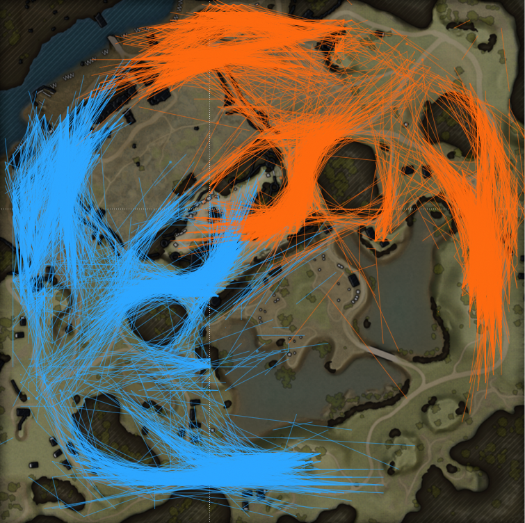
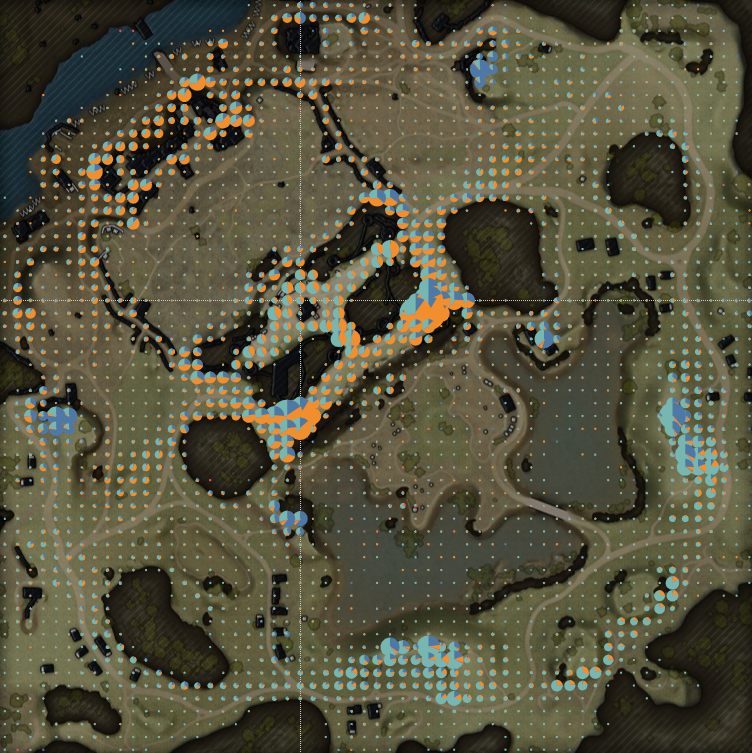
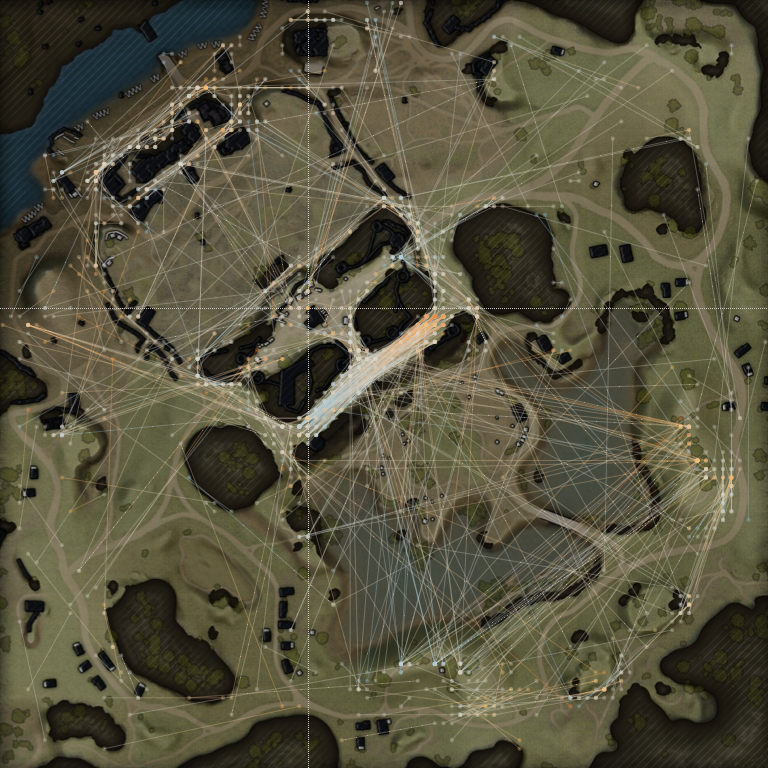
- Movement
- Deployment of Vehicles
- Directions of Shots
Commanders!
Update 1.18, one of the biggest updates of 2022, is out! It brings many exciting features, including the new Outpost map. Take a peek behind the curtain and find out what factors drove our Map Development team to make it a fair, balanced, and—most importantly—fun new battleground.
Join us as we trace the development of the new Outpost map from its initial concept to its eventual release for Random Battles!
Outpost Map: Development Time-Lapse
The map's theme was inspired by various sources. It's not a historical or existing location; it's rather a fusion of several different elements. Our task was to bring something unique to the map that would distinguish it from other maps. Since it's set in Europe, we decided to turn the ruins of a fortress in the center into a unique focal point. A castle with white walls and red tiles can be viewed from anywhere on the map.
We found several suitable references from the Moravia region and began a detailed development. The castle was made up of different references since we needed a unique shape that worked with the requirements of the gameplay.
The castle appears to have been constantly built and strengthened. You can still find old ruins on the map. The walls of our castle are more modern. And the residential parts seem to have been erected from newer stone.
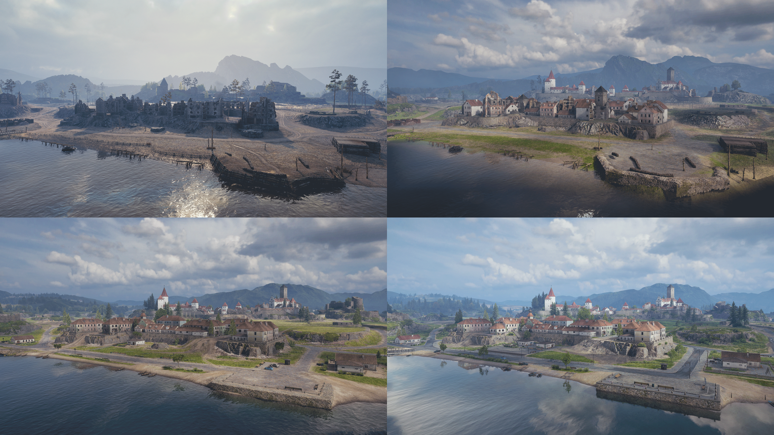
It all started with testing the prototype in the Supertest, in which the map scored one of the best results. After that, some gameplay changes were made, and the artists processed the appearance for release as part of the Recon Mission mode.
The initial idea of the level designer was to make the town by the river a defensive point. On the far side of the river were knocked-out attacker tanks. The bridge was blown up to prevent enemies from crossing. The town and the field behind it were initially on fire and in ruins, showing that the town was defending itself.
At first, we color-coded the zones. The right part of the map was on fire and destroyed. The left part of the map remained calm and untouched, with hills and a small swamp. This made navigation easier.
A reference for wide anti-tank trenches also came in handy. We expanded them a little to allow for tanks to move around them. Thanks to this, we created additional ways of convergence from the heavy tank zone to the center of the map and back.
There were two lakes and rivers in the initial concept. We decided to support and develop this theme by increasing the flooding of the river on one flank, and it turned out to be a rather picturesque corner.
After summarizing the results of the Recon Mission mode, more gameplay changes were applied to the map, and the final artistic processing began. The initial theme of the map was discarded, so new models and textures were created using photogram measurement technology. New effects and animations were added to the map. After finishing the artwork, another Supertest was held to test the final gameplay.
We collected information about the perception of the latest maps, the rebalancing, and the redesigns. We studied which types of covers and positions players prefer and tried to incorporate them into the new map.
Feedback was provided not only by players but also by game designers. Our main goal is to simplify map navigation for players. They have to understand the main directions of movements, easily read the terrain (hills, lowlands, plains), know where there's cover, and enjoy the beautiful scenery.
However, in many cases, there are certain requirements and rules for creating points of interest and forming a front line on a map. For example, the field is a dangerous obstacle for players. It is a necessary element on this map and forces them into specially prepared points of interest. If we had created a city in its place with a large number of driveways and streets, we would facilitate a significant spread of the distribution of vehicles, which would lead to chaos and the absence of a front line.
At the same time, the field makes it possible for a real MVP to shine, and it serves as a place of rapid reoccupation—mainly in the second stage of the battle—if the enemy does not control it. Thanks to this, the gameplay connection between the town and the central part of the map is preserved in the form of available shooting opportunities.
A ridge of stones was removed to make it easier for vehicles to navigate.
A part of the barricades that prevented players from going toward the center of the map was removed.
The shapes of objects were changed to reduce shooting opportunities from the castle.
The main and most difficult task we face when creating maps is the need to balance the effectiveness of five different vehicle classes. They influence one another, and it's important to let players experience opportunities to earn bragging rights, no matter the vehicle class.
Initially, the map turned out to be very beautiful but also very demanding of system resources. We had to remove some animations and objects to avoid players having technical difficulties during a match.
First, we tried to create similar positions on both sides. Then, we constantly studied heat maps and balanced the layout after testing the changes.
Light Tanks Medium Tanks Heavy Tanks Tank Destroyers Self-Propelled Guns
We hope you enjoyed this glimpse into the development process of a brand-new map. Make sure to keep an eye out for an upcoming Map Guide filled with tips and tricks on how to conquer Outpost.
Roll Out!